Cosmetic design
GISOU FACIAL OIL REDESIGN
YEAR: 2022
School Year: SOPHOMORE
Gisou has always explored interesting bodies in their packaging. Although I have adored most of their designs, I feel they could go further in forms when I think of the importance of honey in their products (what they’re mainly known for).
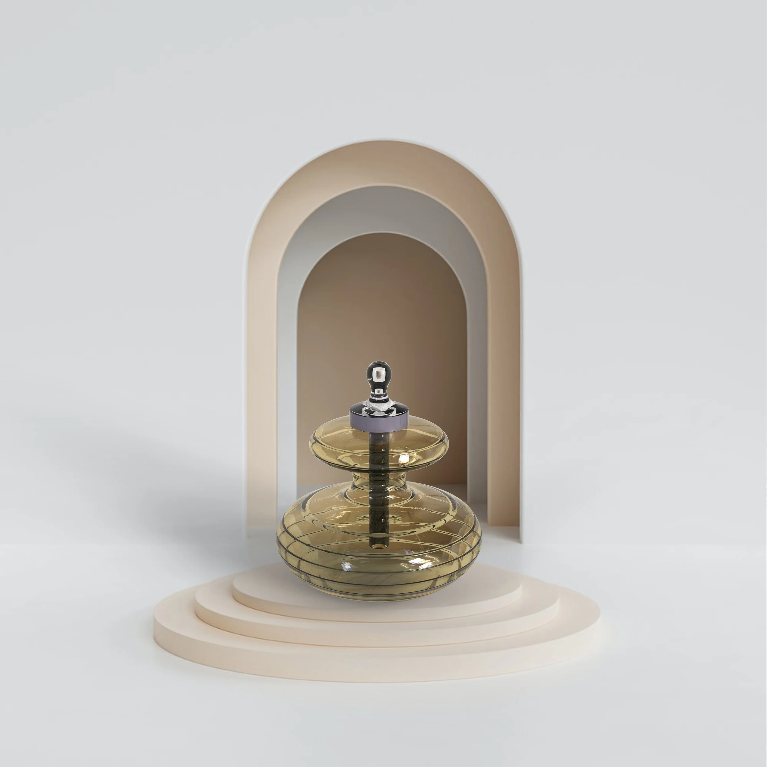
One product in particular is the Gisou Honey Infused Face Oil. When I saw the product I knew exactly what I would’ve done. It felt round and smooth like a honey drop but wasn’t quite there yet. Therefore I took it upon myself to redesign this - how I would do it.
tHE GISOU FACIAL OIL
The only thing I wasn’t a big fan of with the body was when the bottle got oily from the contents of the bottle it make the grip so much harder since the body was so round. Therefore I wanted something that stayed true to the Gisou brand but also had a better grip.
IDEATION
I knew I wanted a round form but still explored a honey comb attempt, but in the end, went for a rounder body. Mainly because their product line does not have many sharp bodies, and I wanted to keep that path in mind.
The final body I went with was similar to the original design but dipped much further to allow the fingers to pinch in the middle to hold the bottle. This is not only a more interesting visual standpoint but also a better user experience. Also adding ridges to the body would help with grip as the smooth body on a face oil that easily gets oily felt helpful.
Although the design feels only slightly different, this was just a personal approach to how I would’ve redesigned this without straying too far from the initial idea. This was also a render exploration during my Sophomore CAD Class.
GISOU X TONI ANN HOFFMAN
The final body
Product
Gisou Face Oil
Designer
Toni Ann Hoffman
packaging
I wanted simple packaigng to kind of have the body be a complex surprise. The blish packaging has a light airbrush graphic on the front that quietly resembles the blish body.


