YEAR: 2024
CATEGORY: PERFUME
I wanted to challenge myself with a product concept for a brand that doesn’t personally align with my style and aesthetic. Therefore I chose Dibs Beauty because I tend to focus on the form to bring visuals rather than graphics printed onto the body. Dibs Beauty had a lot of products involving printed graphics and wanted to explore how I would incorporate that into a more luxury-focused product line such as a perfume bottle.
With this, I took it to design a perfume for Dibs Beauty with inspiration from their existing makeup products, especially including significant iconography to stay on track with their existing branding.
*Case Study
Cosmetic design
DIBS PERFUME
CONCEPT
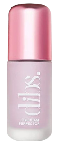
tHE EXISTING PRODUCT LINE
The main goal of course was to introduce a new perfume product without disrupting the brand image. As perfumes tend to be on the pricier spectrum, the feel of this product will be on the more high-end side in terms of material choice and the form it communicates.
IDEATION
I heavily took inspiration from their existing product line to blend the perfume into their brand. I took a lot from the font, graphics and color palette but leaned towards a more luxury standpoint - as perfume tends to be at a higher market value.
dibs beauty X TONI ANN HOFFMAN
Product
Perfume Bottle
Brand
Dibs Beauty
Final ConceptsCONCEPT #1
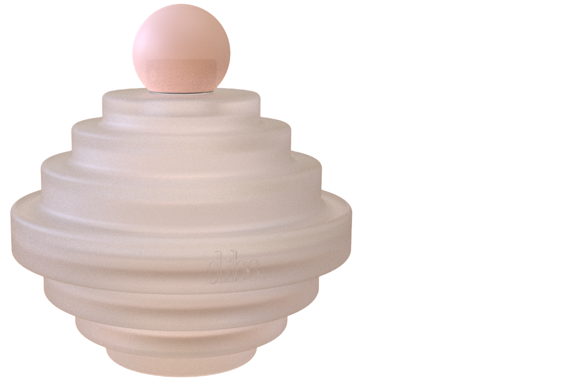
From a luxury standpoint, I wanted to focus on the material choice and not being too direct about the references. The form of the body mimics the reoccurring large to small linear pattern on their existing products.
CONCEPT #3
Leaning towards a beachy vibe, such as a summer fragrance, Concept #3 is a grainy glass finish to mimic sand. The reoccurring pattern is also on the cap, going from large to small lines when seen closer up.
CONCEPT #5
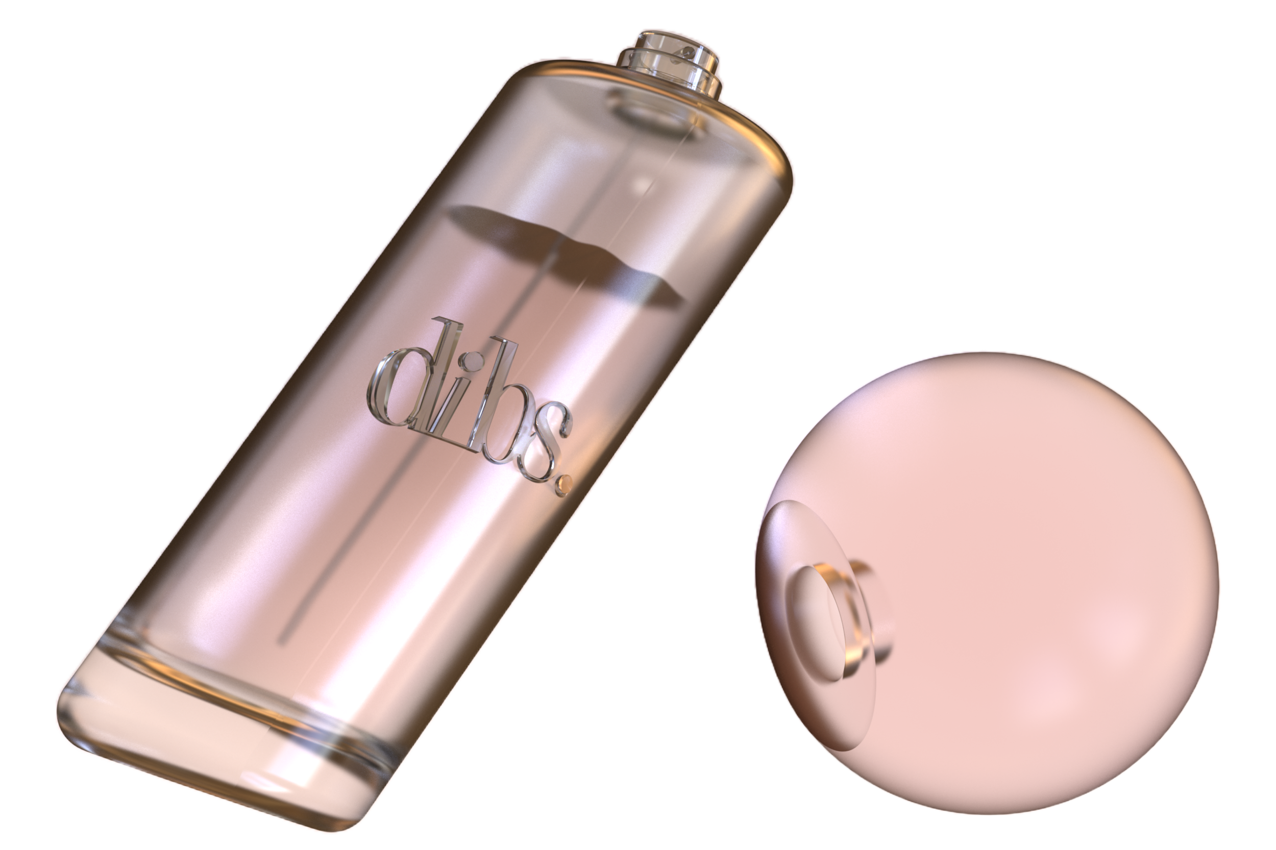
As I was experimenting, I knew I had to lean towards something that was more on-brand to tie in this exploration. The cap for this took colors from their existing brushes, also mimicking the finish. Meanwhile, the ribbed effect is inspired by the reoccurring pattern.
CONCEPT #4
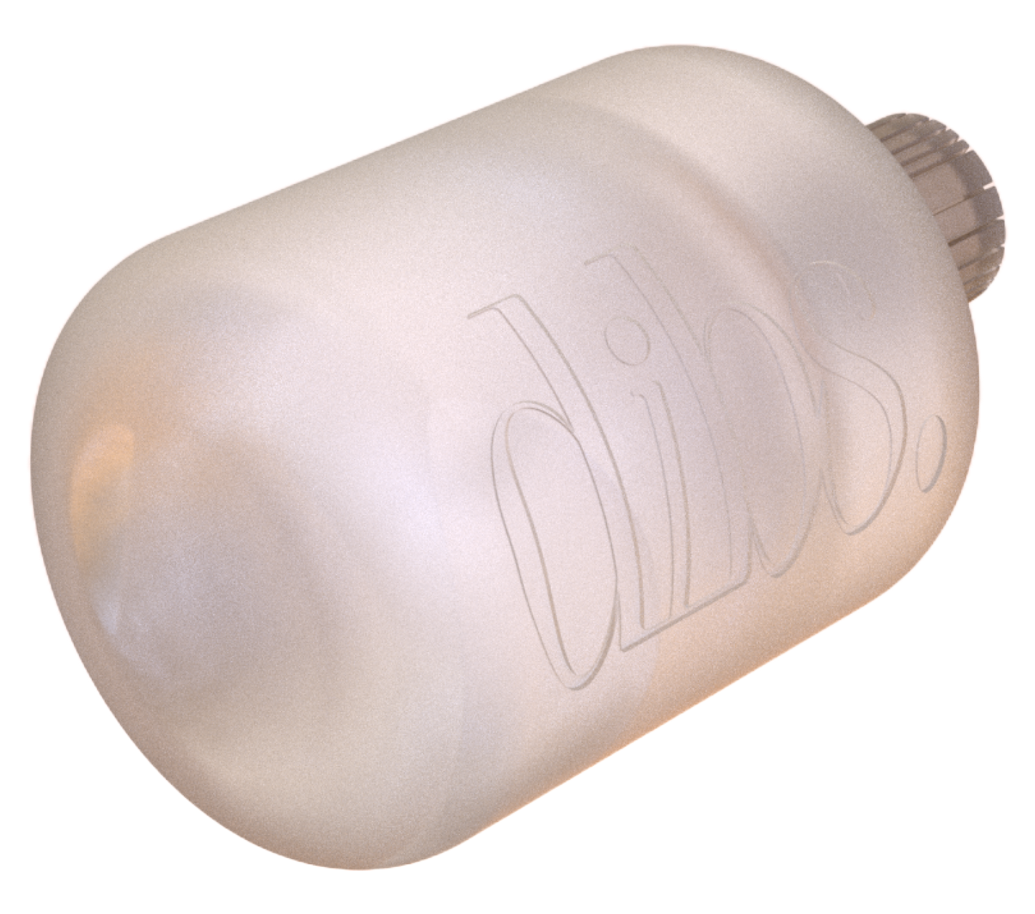
This concept leans more on the abstract end as I took inspiration from the “Dibs” logo, playing around with the letter “i”. In the logo the “i” is leaning (seen on the bottle logo) and I decided to use that as the bottle form as a whole.
CONCEPT #2
Similar to Concept #1 it plays with a more luxurious body, but takes more of a direct nod to the linear pattern on the cap from the existing products. The pattern also holds a more neutral color palette as seen on their existing products.


